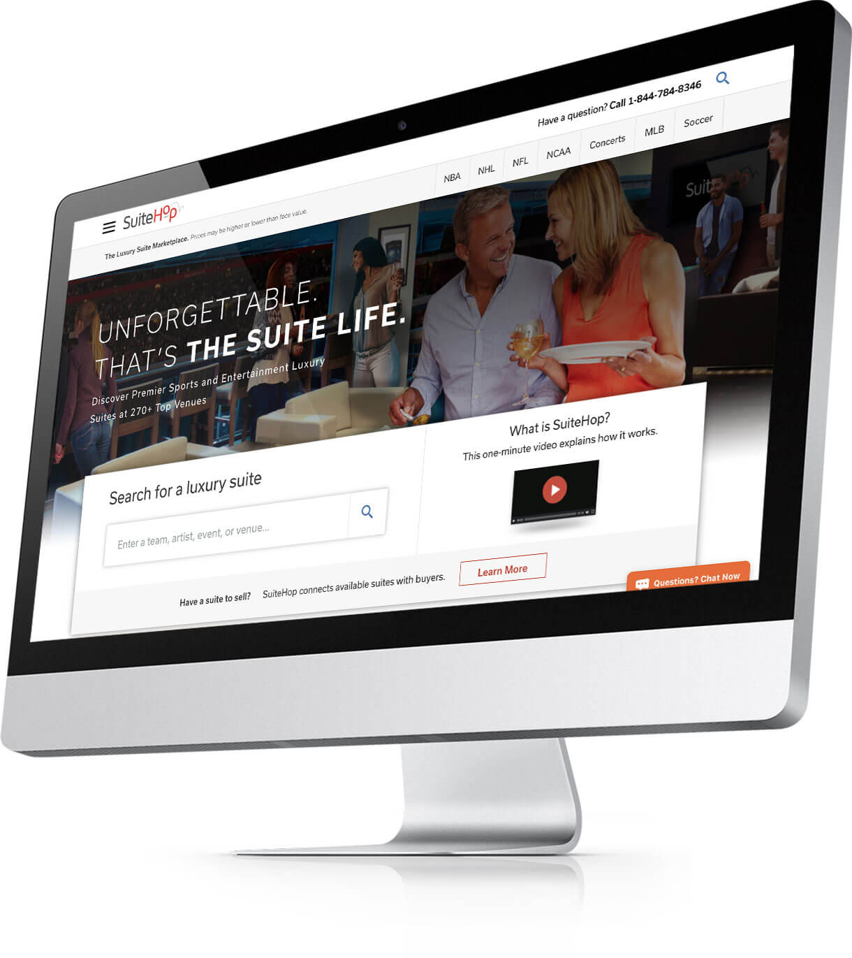
Homepage
Refreshing the brand and making the interface easier to achieve what users want to accomplish.
Old Design
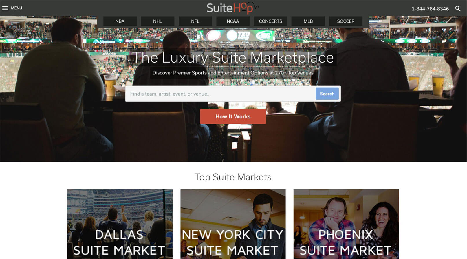
From the old design
The original SuiteHop design used dark colors in the hero with low contrast, hard to read copy, non-inspiring imagery, and an interface that didn’t reflect the top user objectives and was uninformative.
New Design
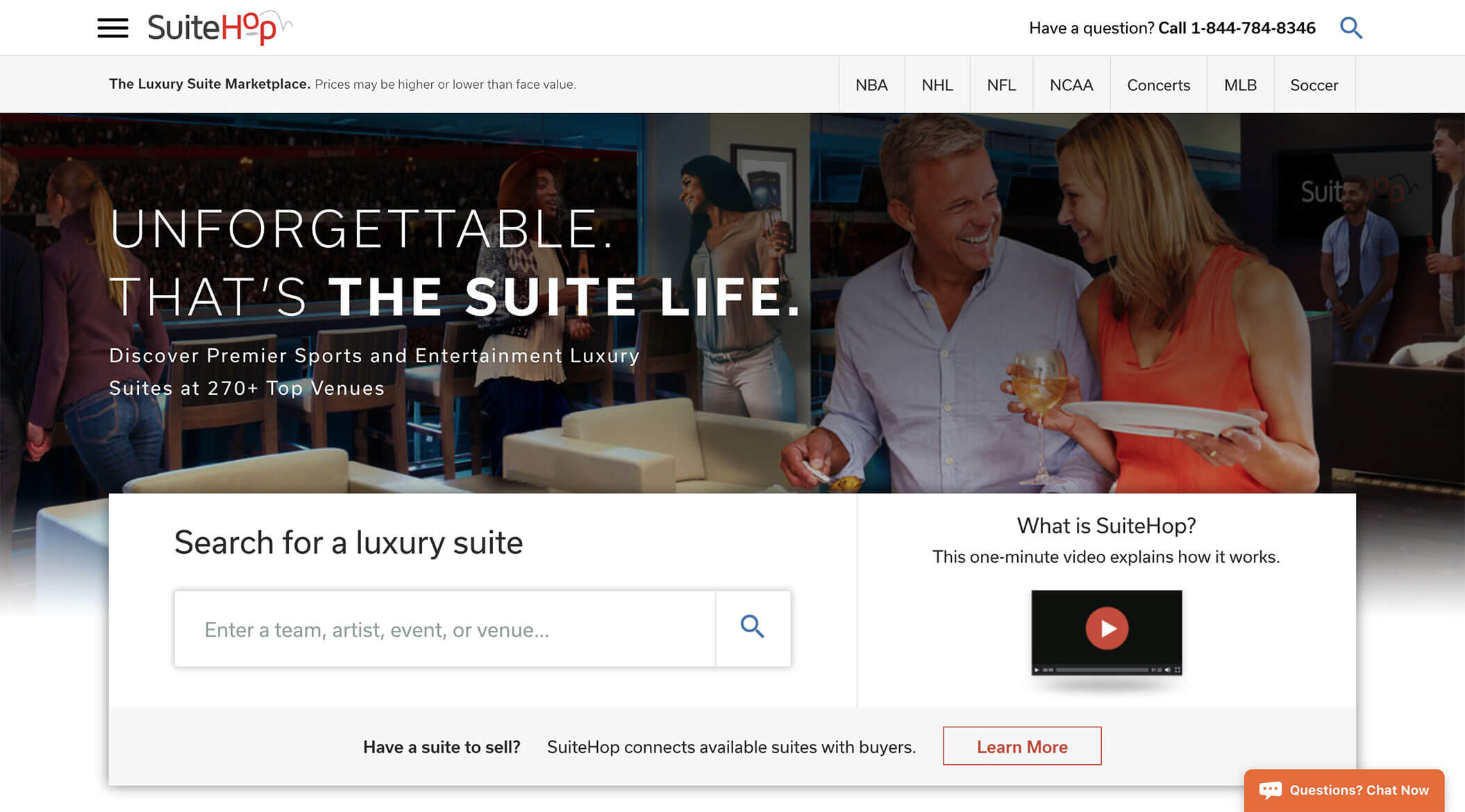
To the new design
A clean and contrasting header, vibrant and engaging custom composited hero image, inspirational tag line, and contrasting interface for searching, selling suites, and watching the video created a more engaging and task focused homepage.
Events pages
A more engaging, informative, and user friendly experience.
Old Design
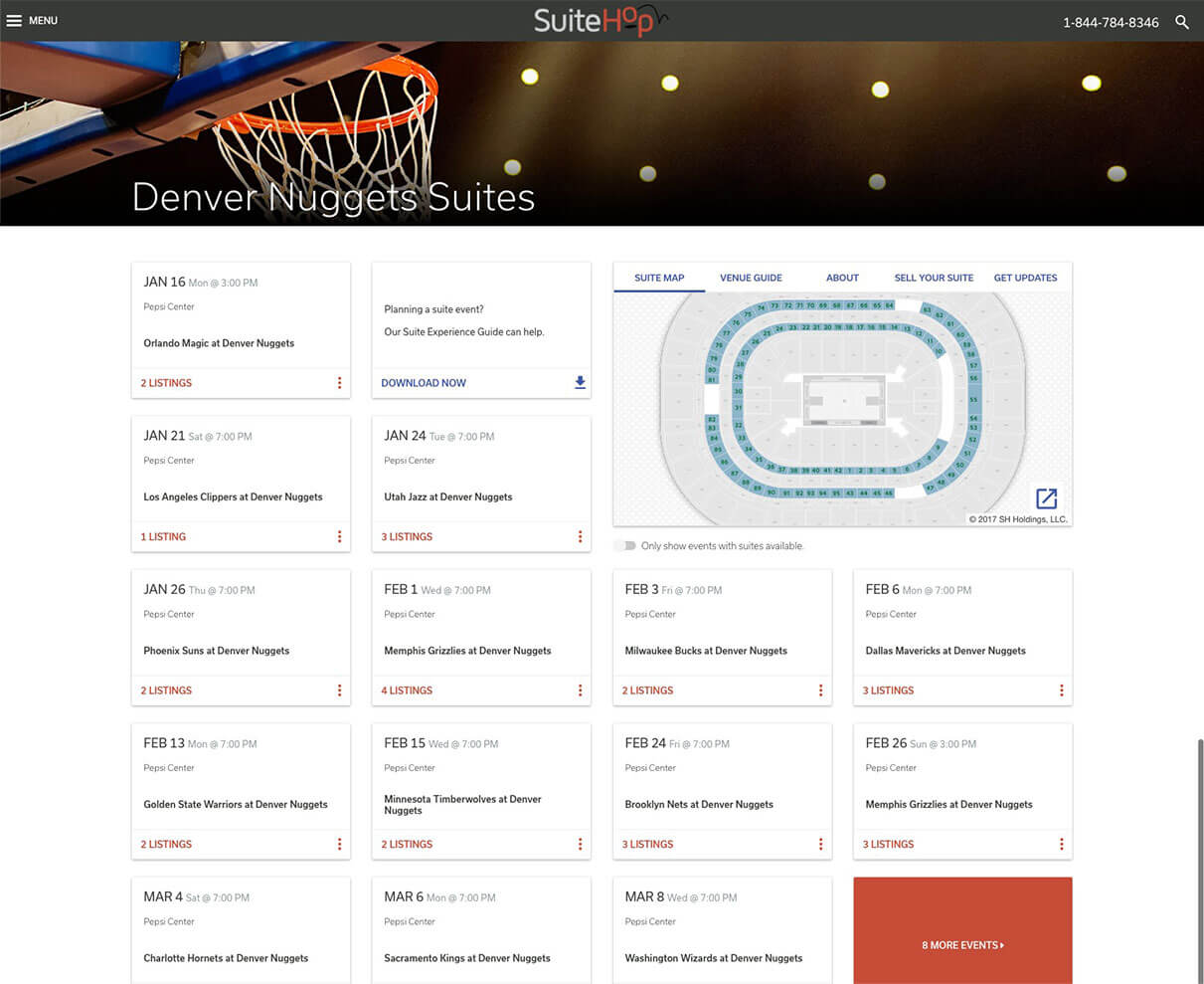
From the old design
Low contrast header with chopped hero image, collapsed search, hard to navigate listings and barely visible educational content made the page bland, difficult to navigate and hard to learn more about suites.
New Design
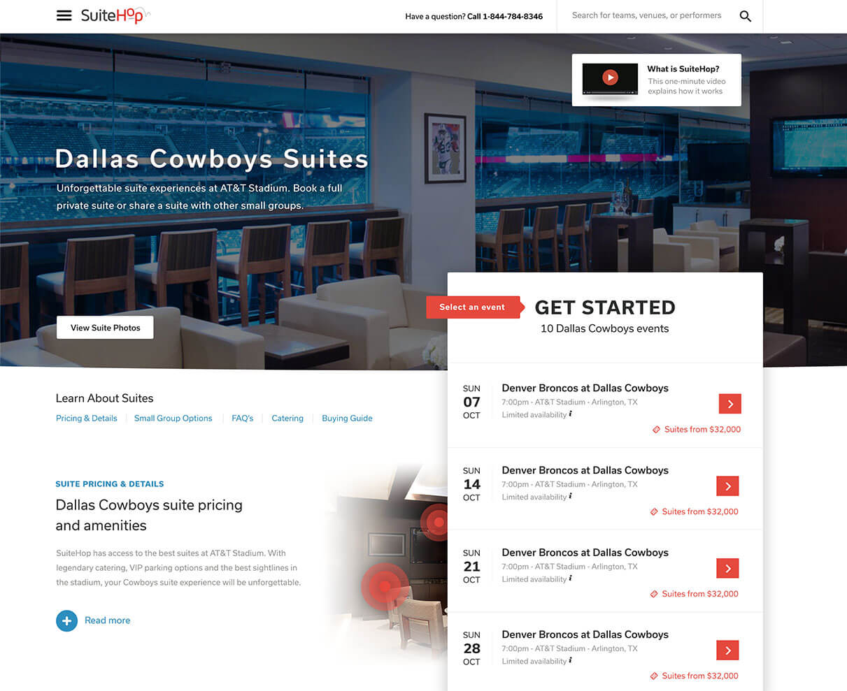
To the new design
Large video showing suite images and customer experiences, a contrasting header, expanded search, large “Get Started” call to action with easy to scan listings and a secondary learning section with educational content made this page a more delightful, informational and user friendly experience.
Landing pages
Engaging, custom designed were pages created for sales support and lead generation.

Walkthrough
Video walkthrough of the designs shown above as well as some of the landing pages.
Technical specifications
- Custom single page app and static pages
- HTML, CSS, jQuery
- Responsive mobile optimized layout
Deliverables
- Creative moodboard concepts
- Mobile and desktop design
- Content strategy and IA
Creative team
- Creative concept – Bobby Benton
- Development – August King, Rob Blakemore
- Content strategy – Bobby Benton, Ann Murlowski, Lloyd Starr

