The challenge
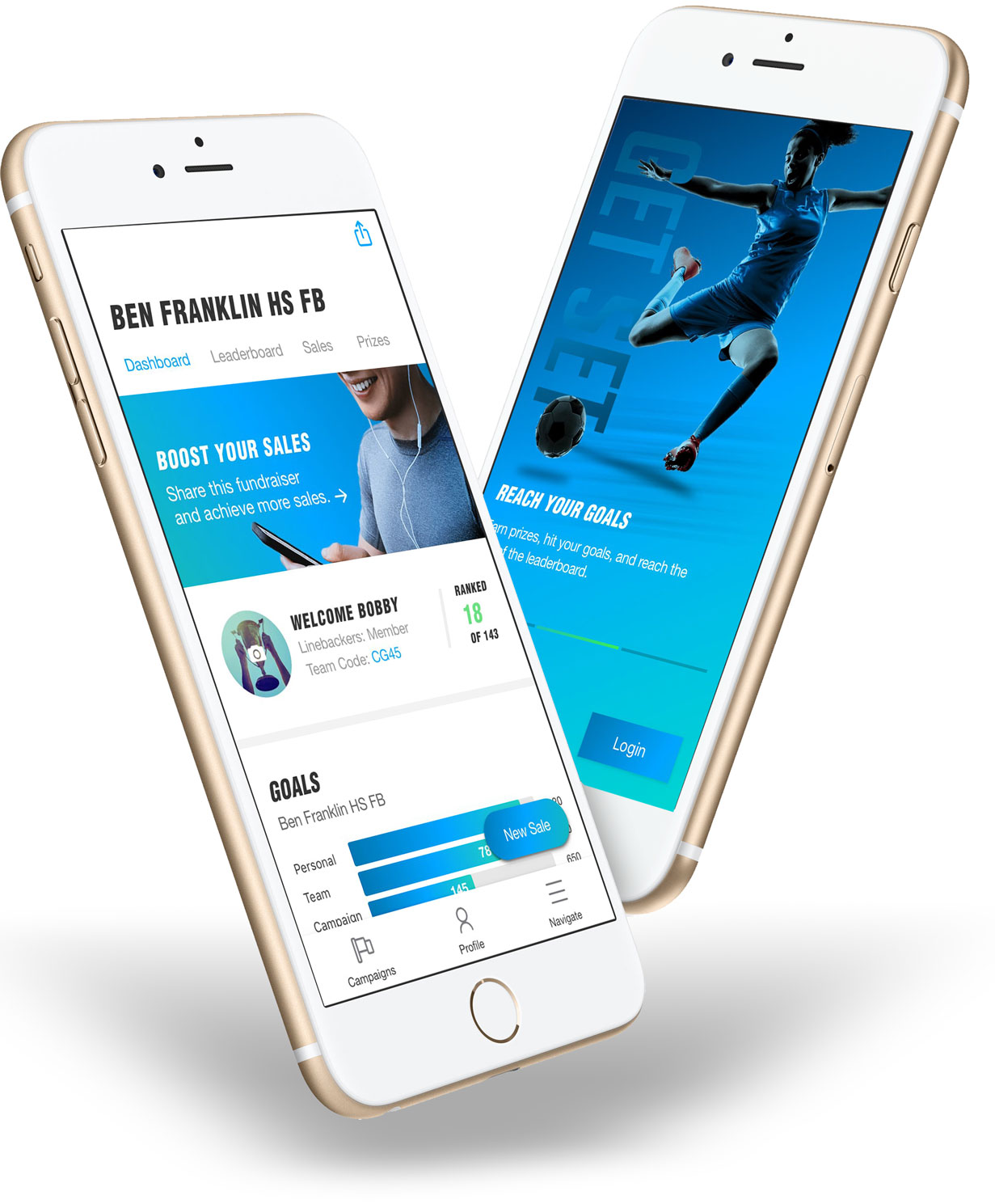
The fundraising company, American Youth is transforming the traditional fundraising efforts for high school teams and organizations in Arizona by providing digital solutions for completing sales, reporting, and fundraiser management for students and organizers. We were tasked with re-designing the user experience, UI and visual design as the existing product is updated to a new framework for iOS and Android. The goal being to increase adoption, engagement, and streamline fundraising sales and management.
Our solution
Native app with on-boarding, simplified user journey, scaleable design system and feature enhancements.
On-boarding
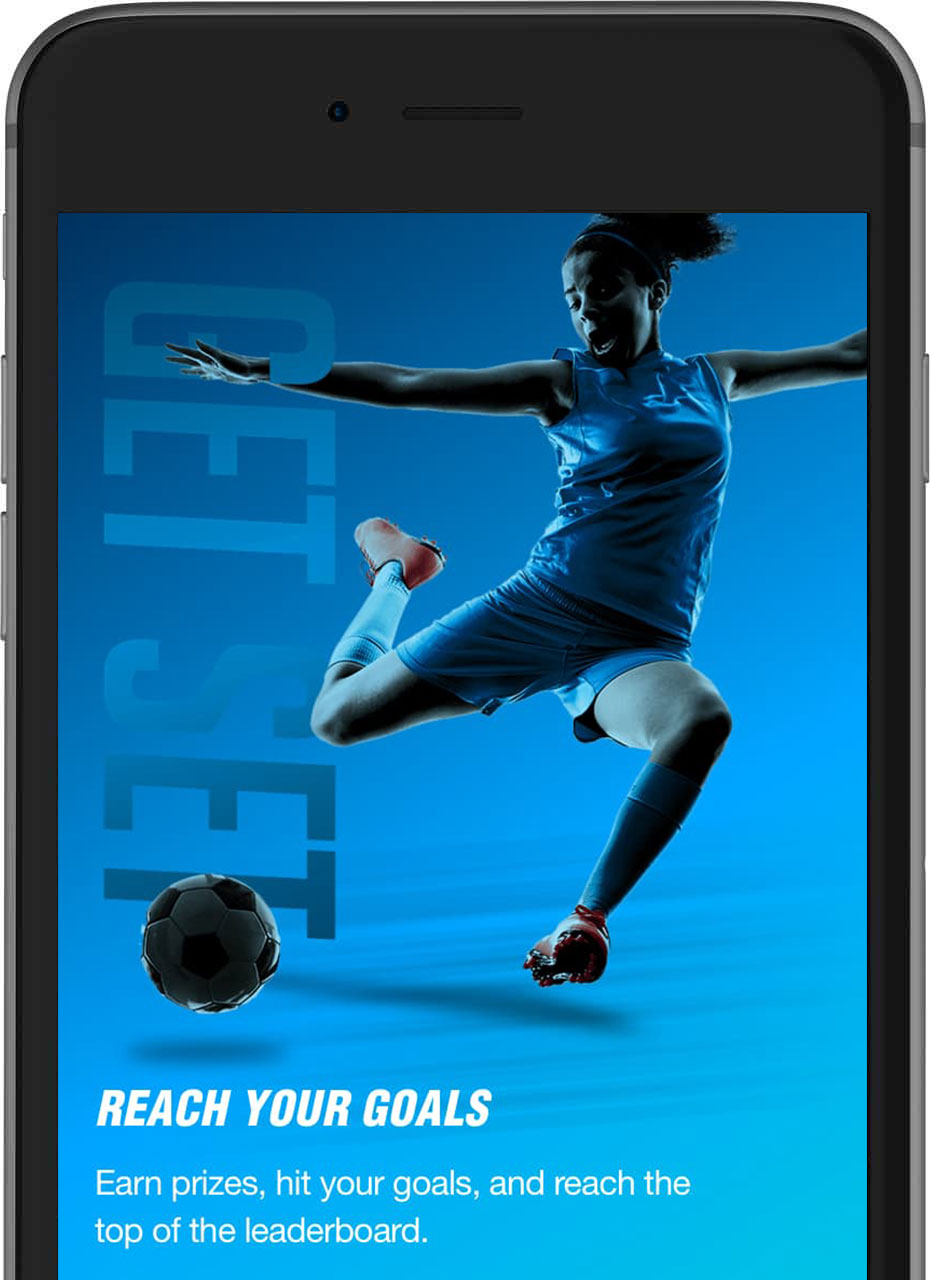
We created a simple and reusable on-boarding carousel that is accessible to new users and users creating a new fundraising campaign to point out the primary app features and value.
Intuitive Journey
Students often make sales quickly so we streamlined the sales flow by making new sales quick and easy. In addition, navigating the sitemap was simplified for increased engagement with meaningful motion design for interactions between elements and screens.
Social sales
The primary goal is fundraising so we created a prevalent call to action for students to share their efforts on popular social networks with customers completing purchases through a secure payment gateway.
Engaging design and scalable UI
A functional design system, vibrant imagery, clean layout and modern typography and iconography creates a modern feel. A scaleable UI adhering to iOS and material guidelines with reusable, modular components was created for rapid design and development of new features.
Product screens
Below are a few examples of the product screens, on-boarding process, and finalized design.
The process
Our strategy
The main feedback from users is that the existing app was difficult to navigate, administer, and complete sales. Secondarily, the design was uninspiring and needed to generate more excitement and engagement. Our strategy was to create a new flattened sitemap that would be easier to navigate from anywhere within the app, streamline the POS sale process with a consistent call to action button accessible anytime within a fundraising campaign, re-think the admin process, create a scalable functional design system of modular components for future roadmap features and update the UI and navigation to be more ergonomic and scalable. Oh and all of this in 4 weeks.
Sitemap and Information Architecture
We completely revamped the sitemap to improve ease of navigation for increased engagement with sections that were previously missed by users in the legacy app. Specifically, we simplified the navigation hierarchy so a user doesn’t need to deep-dive down a rabbit hole of views to find what they are looking for. We then created a simple click-able wireframe prototype to validate the flow and then layered in the content sections based on their importance and relevance to achieving user objectives.
Content audit and feature priorities
As we were completing the IA for each section of the app, we audited the existing content and categorized each element as primary, secondary, or tertiary, placing each in the proper hierarchal location based on importance. For example, list views might include the most important data associated with an item for the user to easily glance without having to deep-dive into an items details. We then place secondary and tertiary content within the item details view. We also roadmapped a features list and incorporated the most important and technically feasible features (like social sales) into the requirements.
Updating the design
The original design for the app was lacking depth of imagery, iconography and color. We updated the look and feel by incorporating vibrant, youth focused imagery, bold and italic headlines for a sense of movement, simple and modern iconography, subtle gradients and a clean layout with contrast between light surfaces and colorful images and graphs.
Streamlining Sales
Students sell a majority of products to parents and other students in person so they need to make a sale quickly and error-free. We created a floating and persistent “new sale” button adhering to Google’s Frequent Action Button guidelines from Material Design to make sales accessible anywhere within a fundraising campaign. For completing sales, we divided a sale into a stepped process with relevant views for form elements like capturing customer details, payment, review, and confirmation. Validation was added for fields within a current step and a student can easily move back and forth throughout the process to make changes if needed.
Scalable design system
Collaborating with the developer, we designed around the UI component library React Native Elements within the React Native framework. Our approach was to create modular and scalable components that could be easily added or removed from the user flow based on relevance and permissions without the need for custom design modifications. We adhered to Google Material and iOS Human Interface Guidelines for surfaces like cards, headers, navigation bars, CTA’s and movement between sections of the app.
Results
We are currently building the app and will begin beta testing with students in the next few months but initial prototype feedback has been encouraging with a general consensus that the app is easier to understand, navigate and complete POS transactions. We will continue to add feature enhancements based on beta testing feedback over the next few months.
Development framework
- Native iOS and Android
- React Native
- React Native Elements
- Amazon AWS
- Social Media API’s
- Twillio SMS
UX deliverables
- Sitemap and IA
- Design system
- Wirerames
- Clickthrough Prototype
- Visual Design
- Motion Design Interactions
Design & prototyping tools
- Sketch
- Invision
- Invision Studio
- Photoshop
Testing
- Gorlilla Testing


